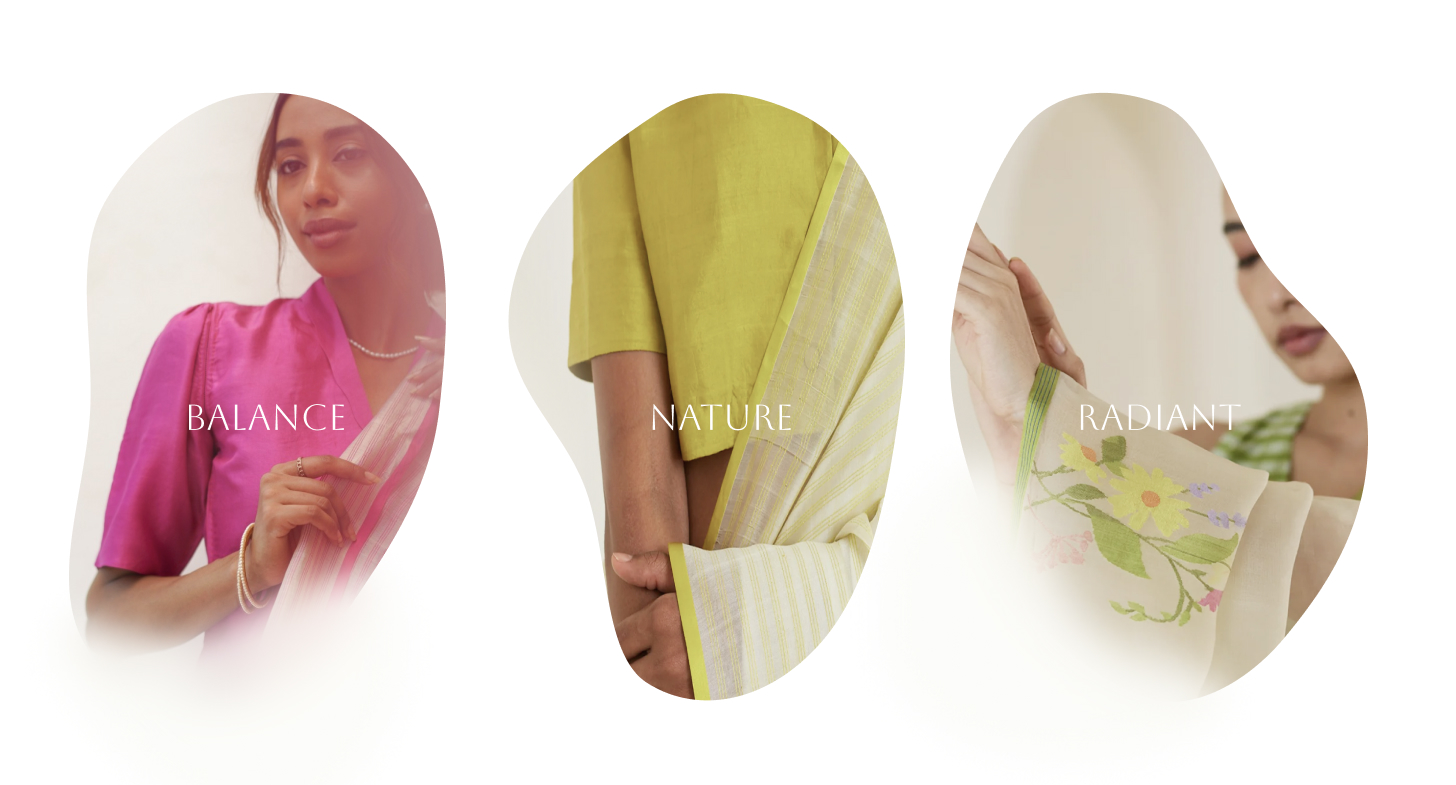
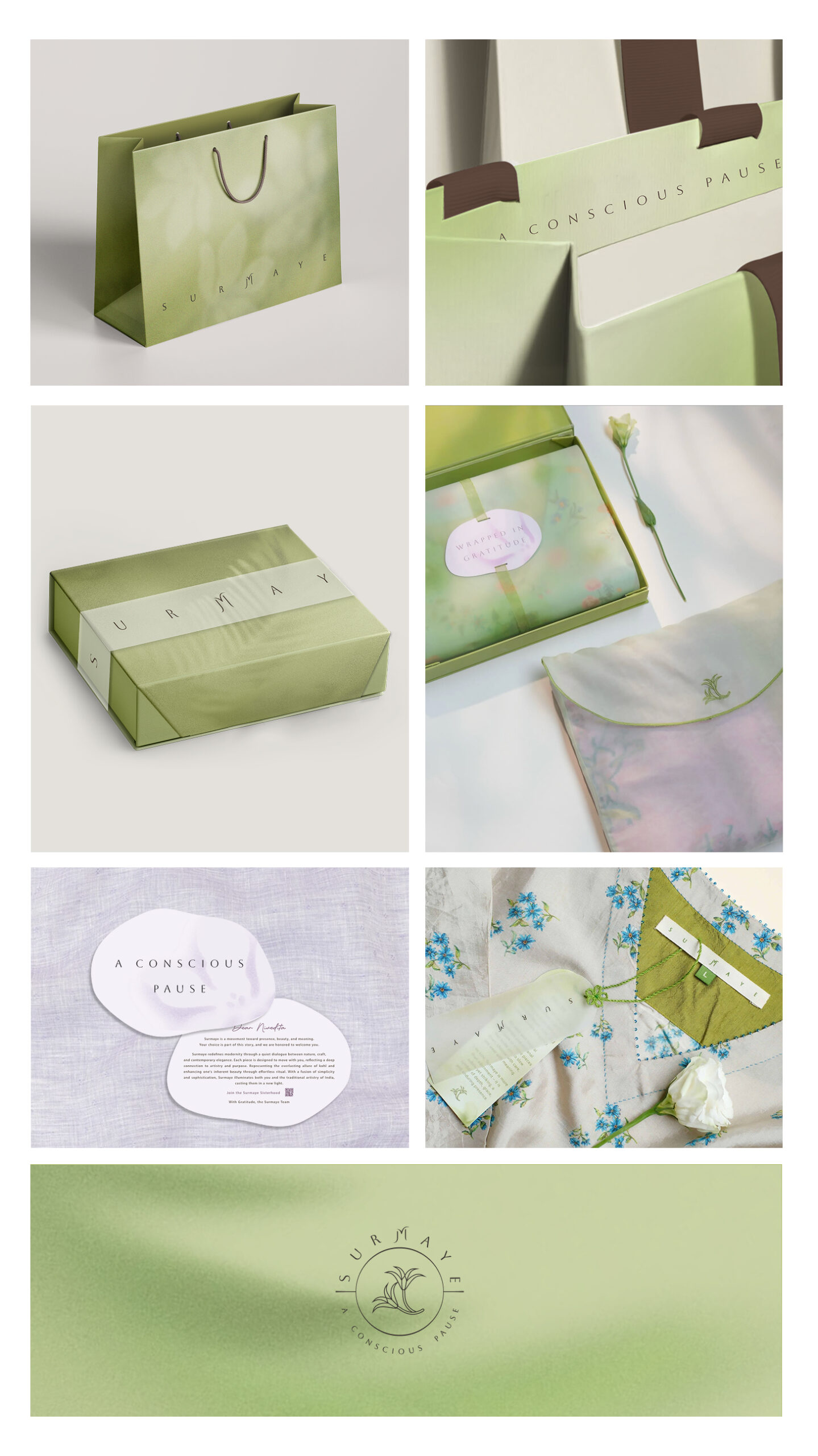
Surmaye’s visual identity reflects a quiet elegance rooted in nature, balance and modernity. With soft, organic forms, spacious layouts, and a fresh, airy palette, the brand feels grounded yet light. Every visual element — from typography to illustration — is designed to evoke calm, clarity, and a sense of slow, intentional beauty.
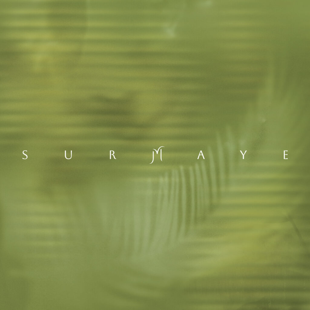
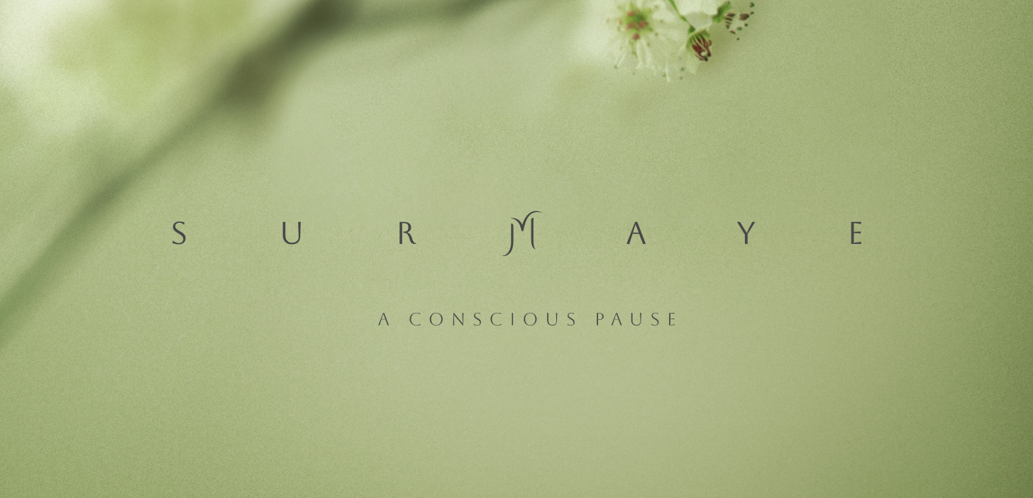
The logo’s letterforms are intentionally spaced, creating a measured elongation that mirrors the philosophy of a conscious pause. The central ‘M’, with its organic curves and floating form, becomes a gentle anchor — evoking balance, clarity, and a sense of lightness within the brand identity.