Scope of work
Digital Communication
Website Design
Background
Planet First Partners is an Europe based venture capital firm creating a real impact for long-term investors and operational advisors. Their purpose-led value creation approach means that they work as “hands-with” active partners with like-minded entrepreneurs and investors to scale ventures that deliver positive impact outcomes.
They are passionate about empowering visionary entrepreneurs who build on disruptive market insights, science and technology, and collective intelligence to develop sizeable and meaningful businesses.
Approach
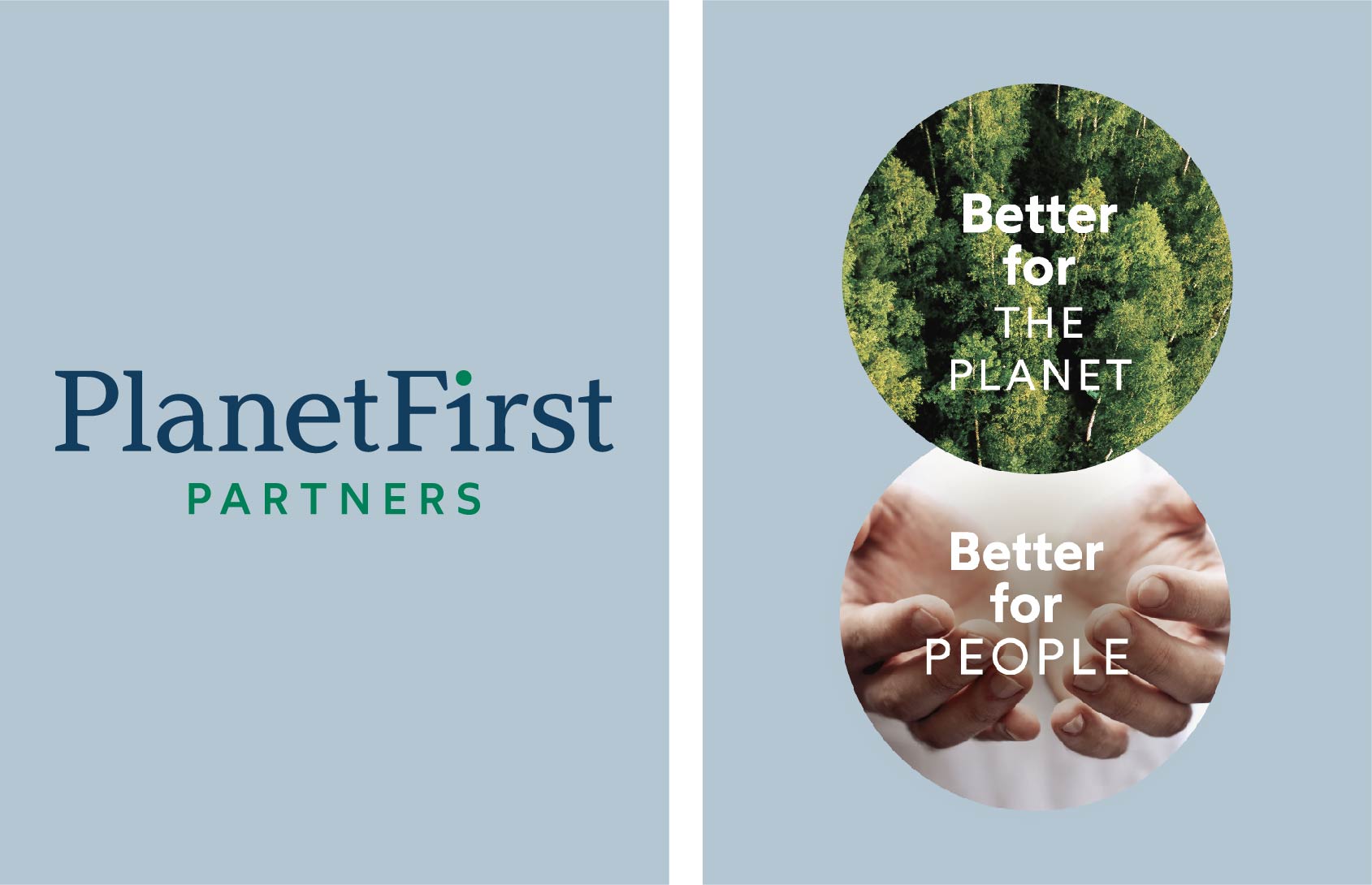
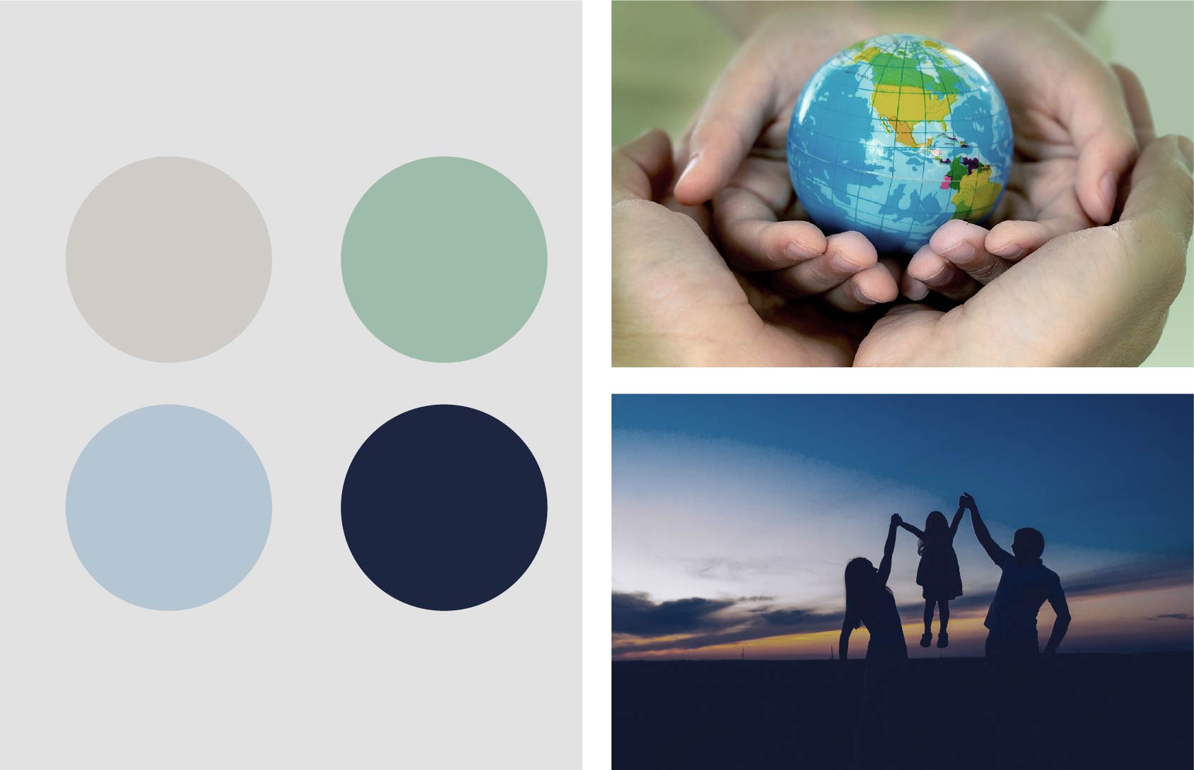
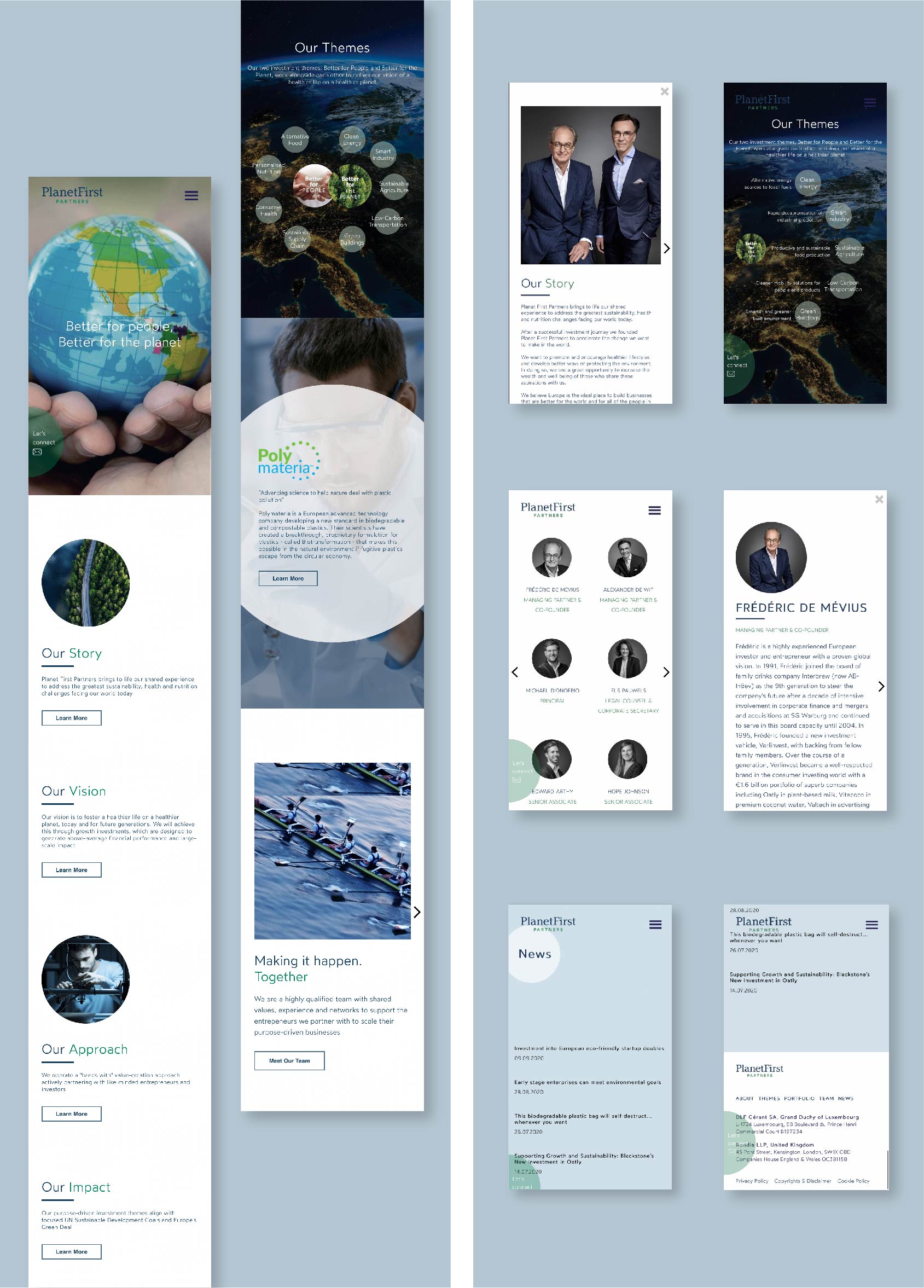
Starting by extending the visual language from the initial logo mark, we have decided to use a planetary circular shape as a visual anchor and combined it with soft hues of blue and green.
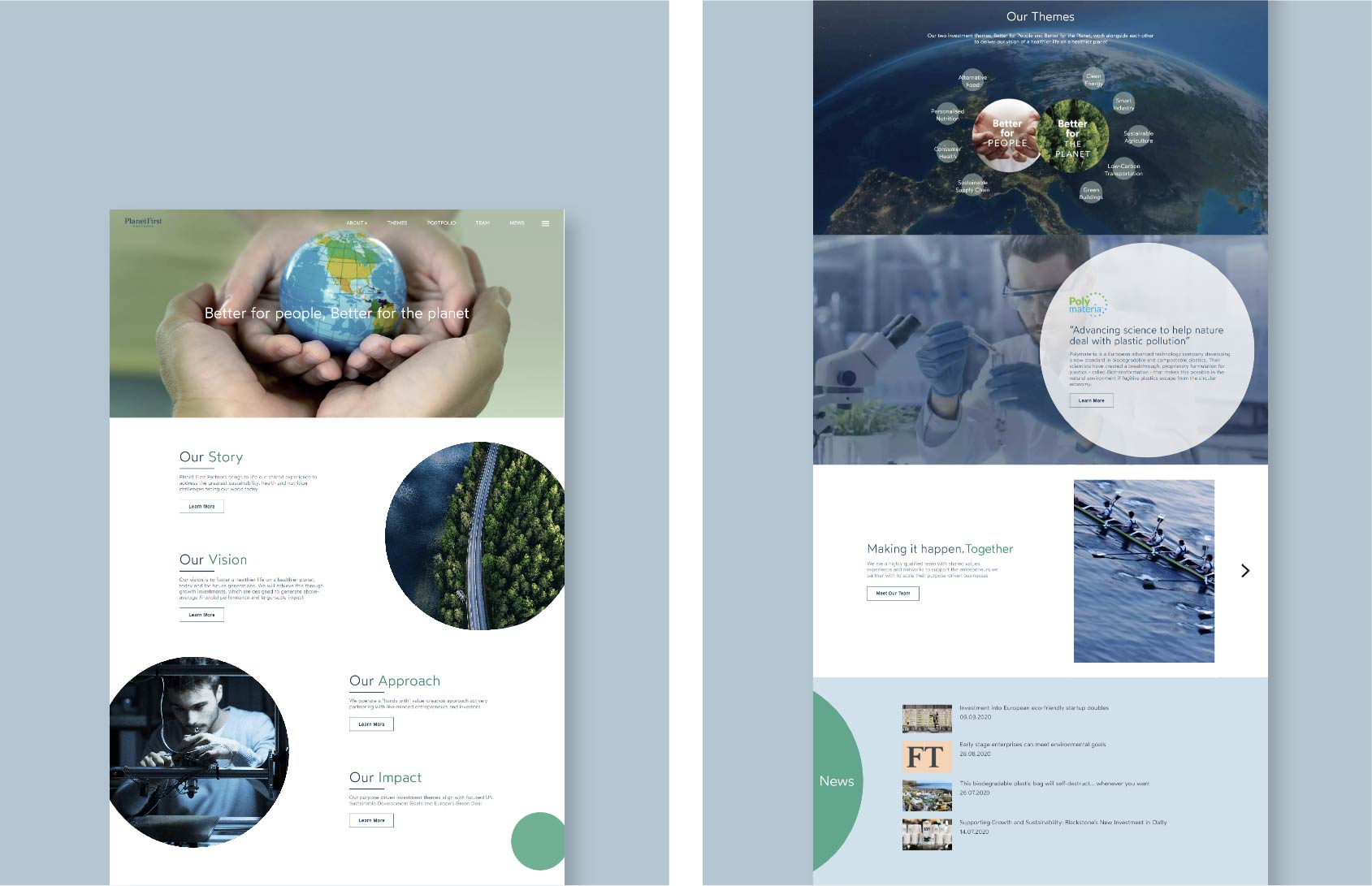
We have designed a smart and clean interface with a minimal navigation experience around a long vertical main page and horizontal popups guiding the user through the company manifesto, investment thesis, portfolio companies, collaborators and partners