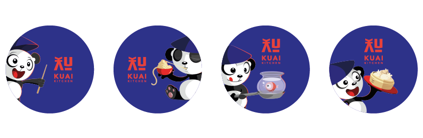
Kuai Kitchen


Scope of work

Branding Visual Language Collaterals

background

Kuai Kitchen is a new F&B outlet based in Colaba, serving a variety of Pan Asian delicacies. The restaurant is an off shoot of The Royal China Team and Jia. We were approached to develop branding and visual language for their new venture.

Brand Identity Logo

Customized typography influenced by oriental aesthetics were considered for the main logo unit. By re-structuring the flow of alphabets like the “K” adjoined with “A” and “U” with “I” we come to a form that visually looks oriental but reads Kuai in English.   A clean bold typography unit with strong contrasting colors was designed for Kuai Kitchen’s brand identity.   The KUAI typography was created to compliment the oriental aesthetic of the restaurant, while keeping it bright and playful.

Brand Mascot:
Brand mascot for Kuai Kitchen – A depiction of an asian animal that resembles qualities of adorable and playfulness. We opted to illustrate a panda cub, often nicknamed the Asian bear or Oriental bear. Panda cubs are adored for their puppy-like resemblance and unique color scheme.

The mascot’s illustration was predestined to be paired with the brand’s identity alongside the logo of the restaurant and is meant to be across menus, packaging and other collaterals.

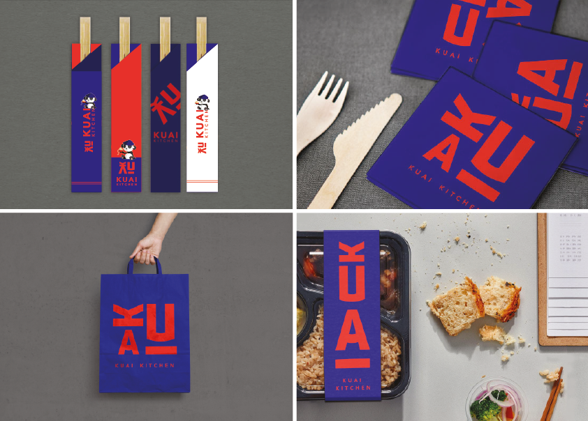
Various Collaterals: