True School of Music


Background

The True School of Music beats at the very heart of Mumbai’s thriving entertainment business. Its aim is to train the next generation of musicians, artistes, producers, sound engineers, composers and DJ’s to feed the increasing demand for music within India’s burgeoning music scene. There has never been a better time to be a musician in India and there has never been a school quite like True School to help, achieve your goals

objective

Our objective was to enhance and improve the existing visual language based on their current Brand guideline taking into account the requirements for the entire digital solution. Making the logo and the colours digital friendly was a crucial part as the main communication channels were digital.

approach

We crafted a simple digital journey for True School of Music’s audience. We conceptualized  a fluid experience from browsing courses, providing details and application for the school in a structured manner so that the applicant can enroll effortlessly for the course of their choice. We developed and implemented an energetic and playful visual identity that finds a commonality of form with music, but introduces, in a considered and moderated way, a cheerful personality through bright colour and pattern.

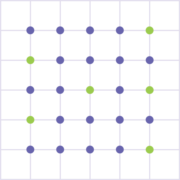
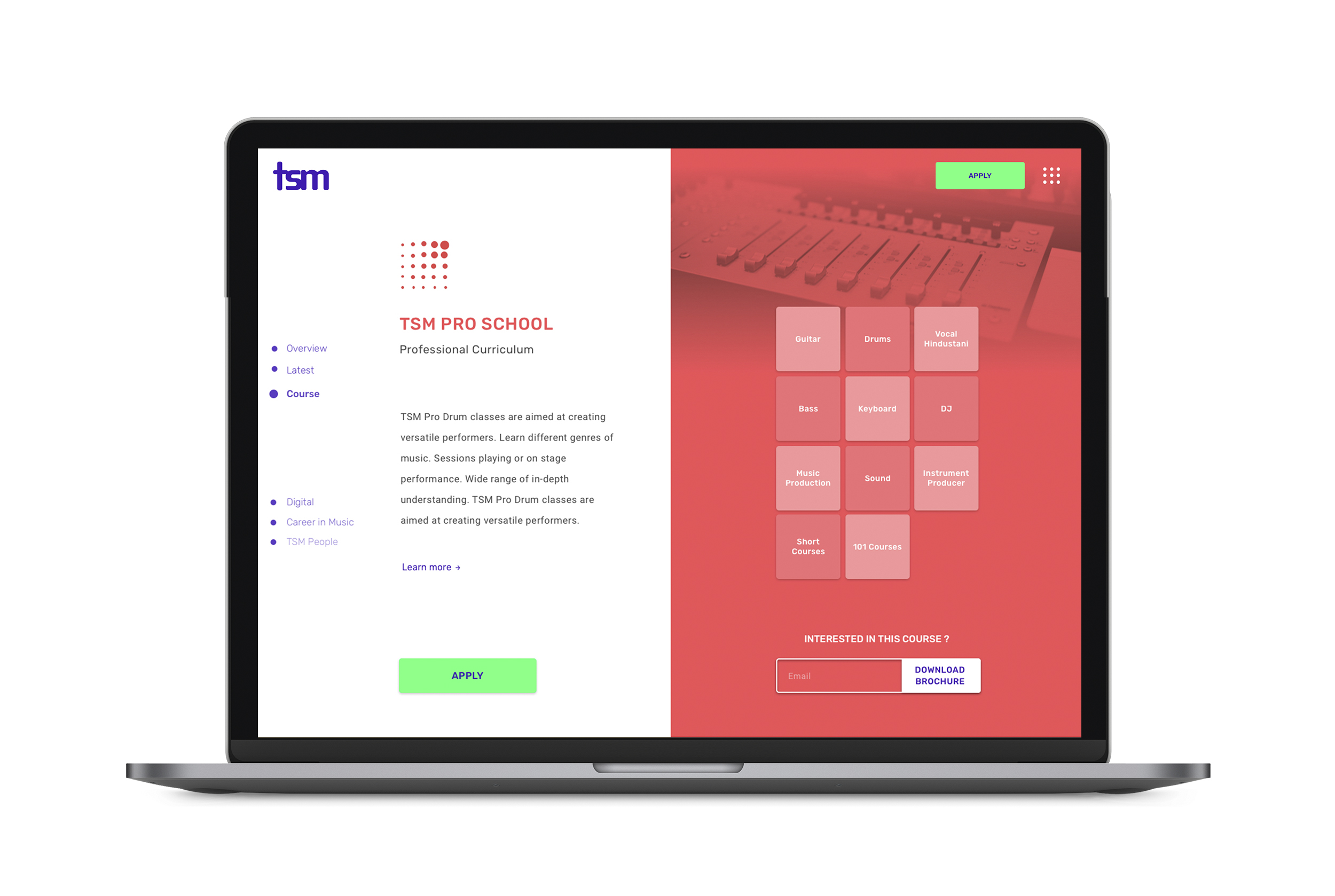
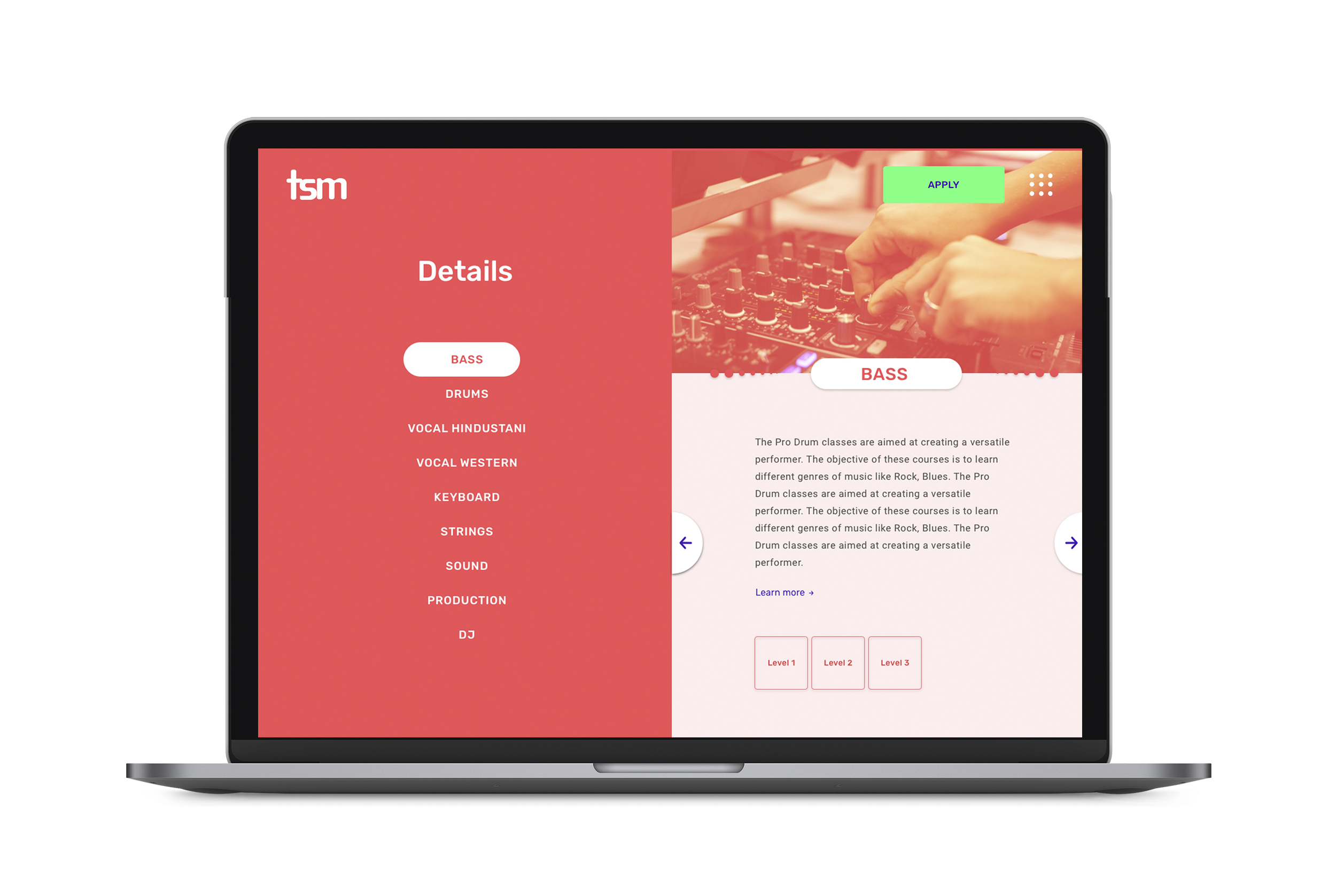
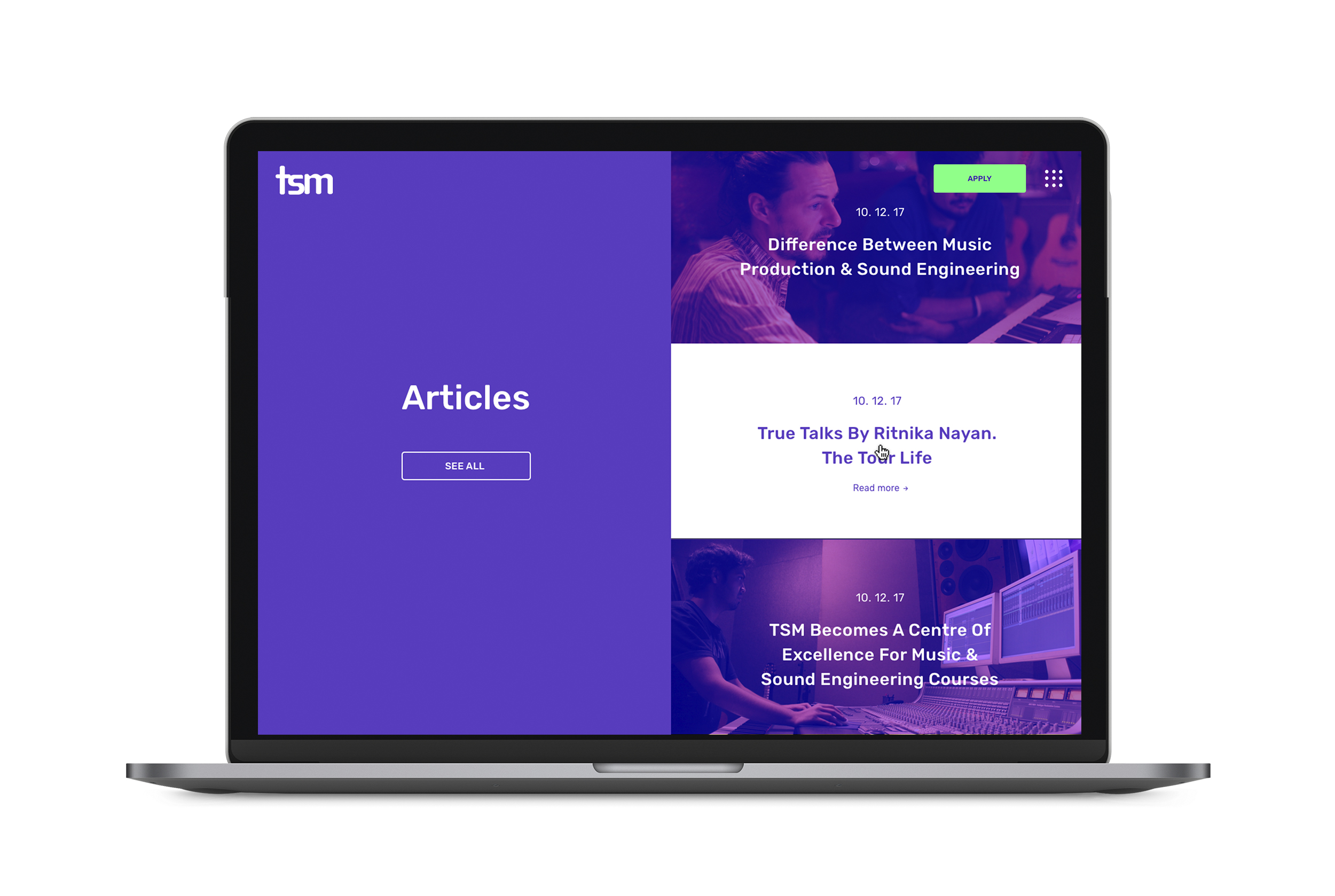
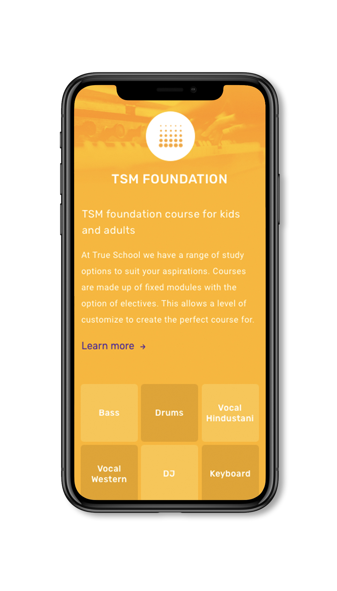
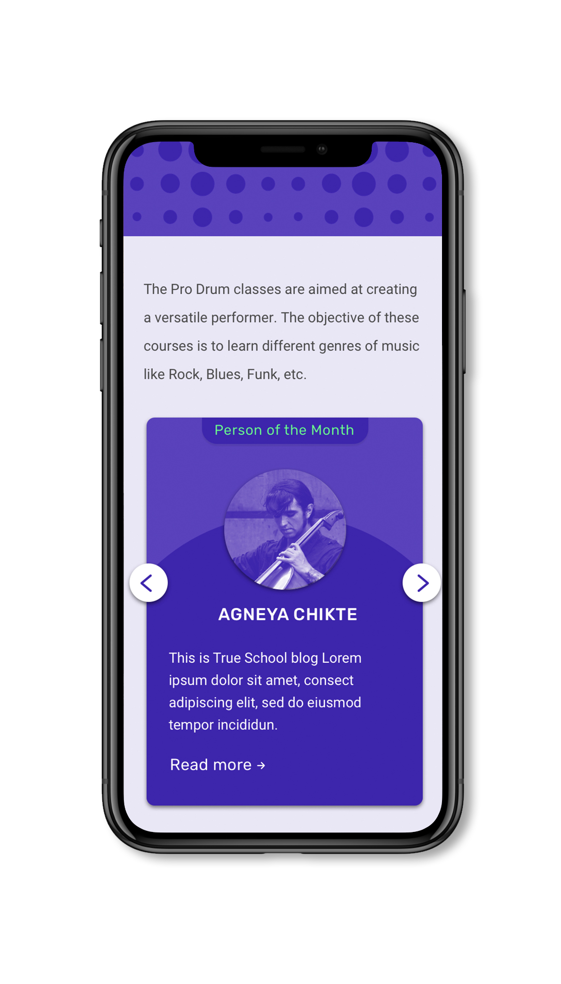
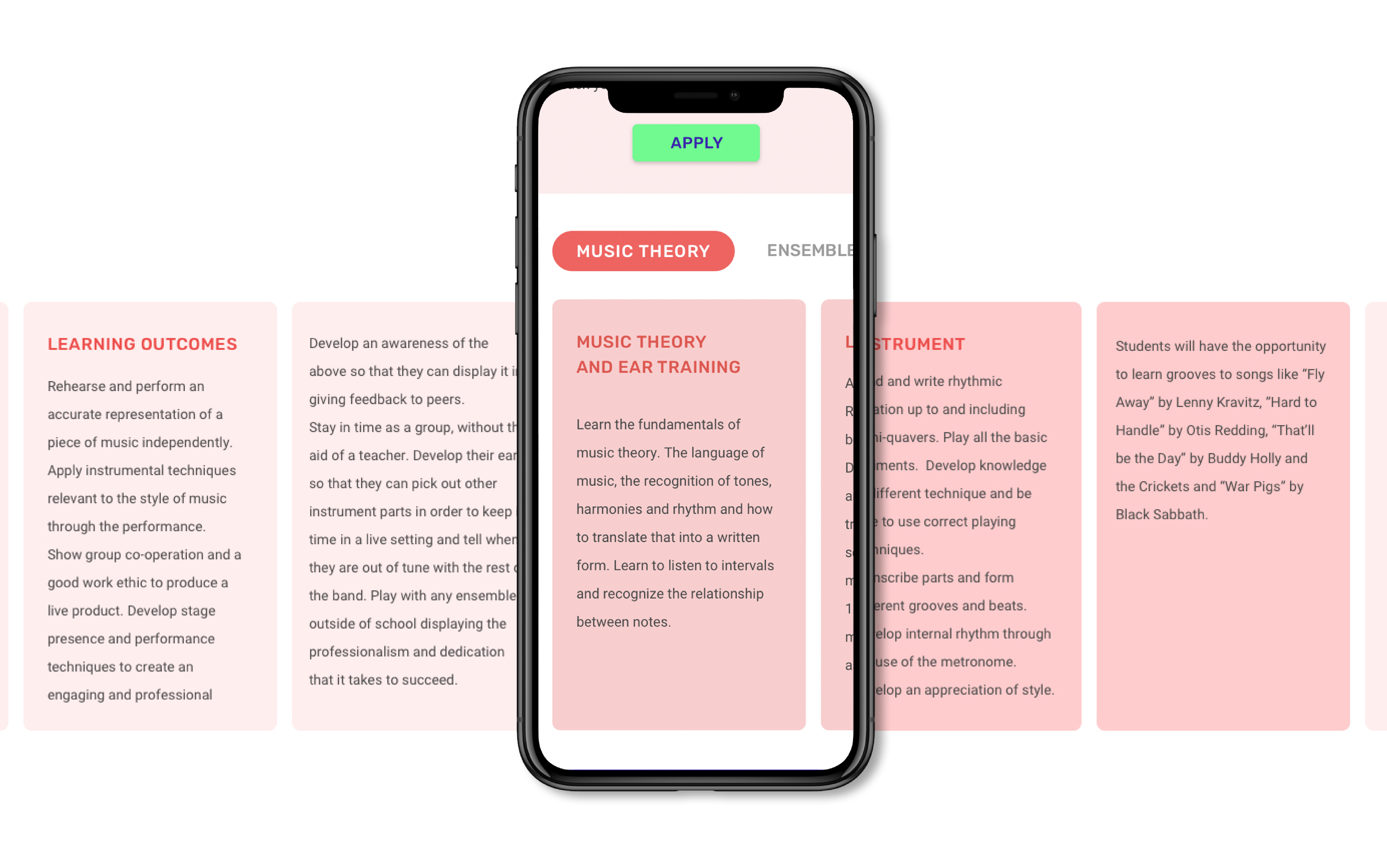
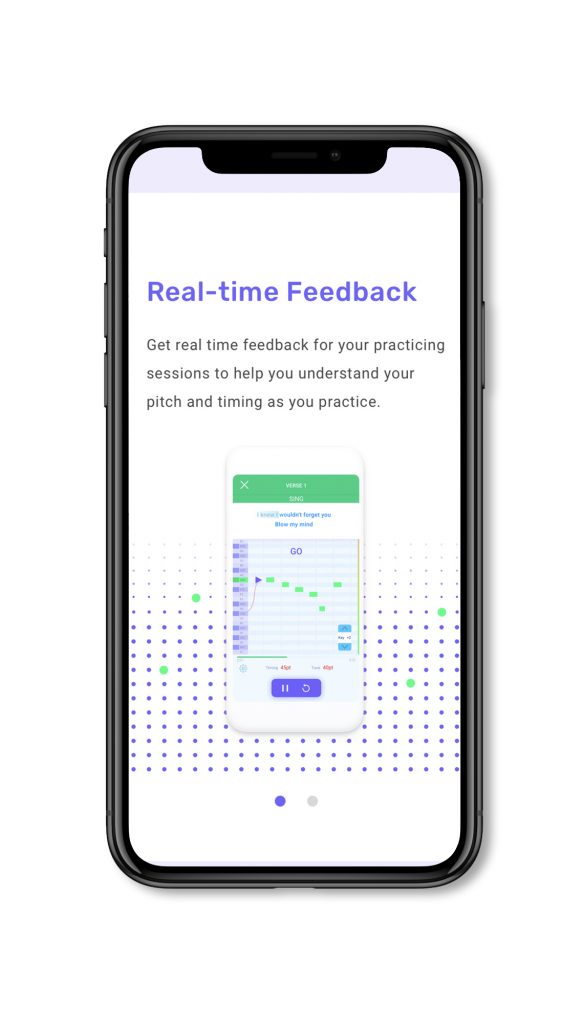
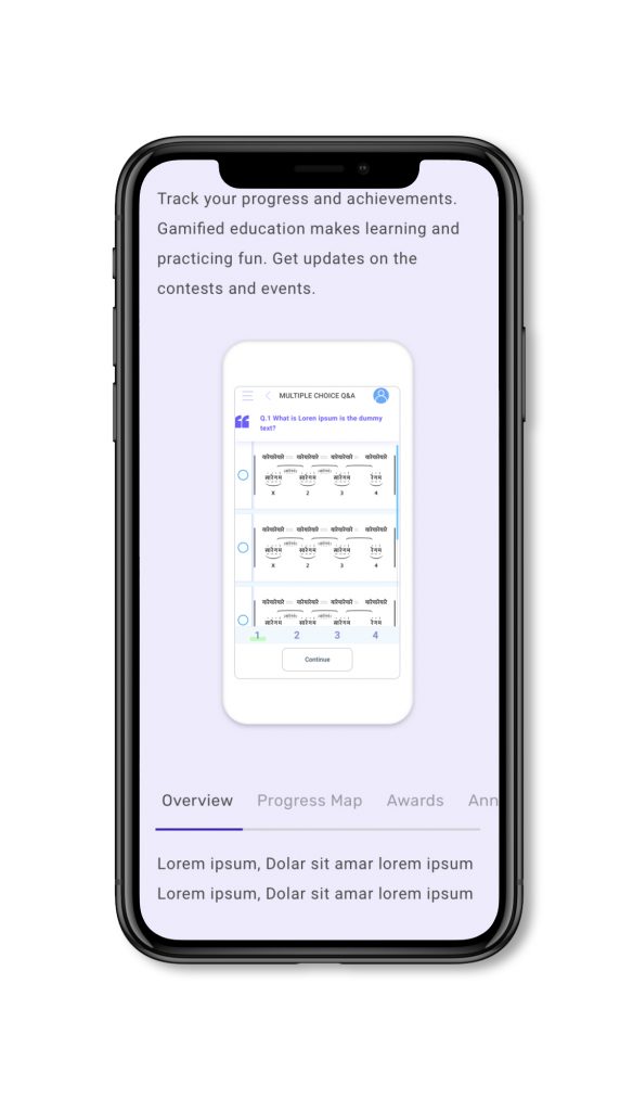
The entire visual language is inspired from the music grid. Patterns appear dynamic, both in their static and animated forms with plenty of variety. When visual identity is seen together, as documented here, the extensive use of colour and pattern appears occasionally overwhelming yet, when considered within the context of different platforms and courses, it begins to make a lot more sense. Through a strong highlighting of the project’s graphic charter and identity, the user is directly immersed within the brand’s universe.

Our icons are designed on a grid. All the icons for Learn to sing app is made using the grid.

The desktop website design is recreational and dynamic. The icons are inspired from the launchpad. Such treatment of the buttons gives an authentic vibe of music.

The user interface is thought with an easy experience for the user as well as the responsive aspect.

The user interface has a multiple  colours. The animation enhances the experience by showcasing the main piece of communication in a clear manner. Here, when the cursor hovers on one of the article, the title of the article minimally communicated.

Mobile website design interface is thought for good usability. It has a normal vertical scroll. Cards are designed for vertical scroll.

All the scrolls are designed keeping the smooth experience which we want to deliver to the user.